

Your blog’s color scheme does a lot of heavy lifting. Before someone reads a single word, the colors on your site are already making an impression, communicating your style, and either attracting or repelling the exact people you want to reach. So choosing the right color scheme for your blog isn’t just a design decision. It’s a branding decision.
The good news is that you don’t have to be a designer to get this right. Let’s walk through exactly how to choose colors that feel like you and work beautifully on your site.
Consider Your Niche and Target Audience
The first place to start when choosing a color scheme for your blog is your niche and who you’re talking to. Think about the overall vibe you want your readers to feel when they land on your site.
A food blog might lean into warm, appetizing tones like reds, oranges, and creamy neutrals. A wellness or mindfulness blog might feel more at home with soft greens, blues, and earthy tones. A fashion or lifestyle blog might call for something bold and editorial. None of these are rules, but they’re helpful starting points when you’re not sure where to begin.
Ask yourself: what do I want my readers to feel the moment they arrive? Then work backward from there.
Look to Your Own Content for Inspiration
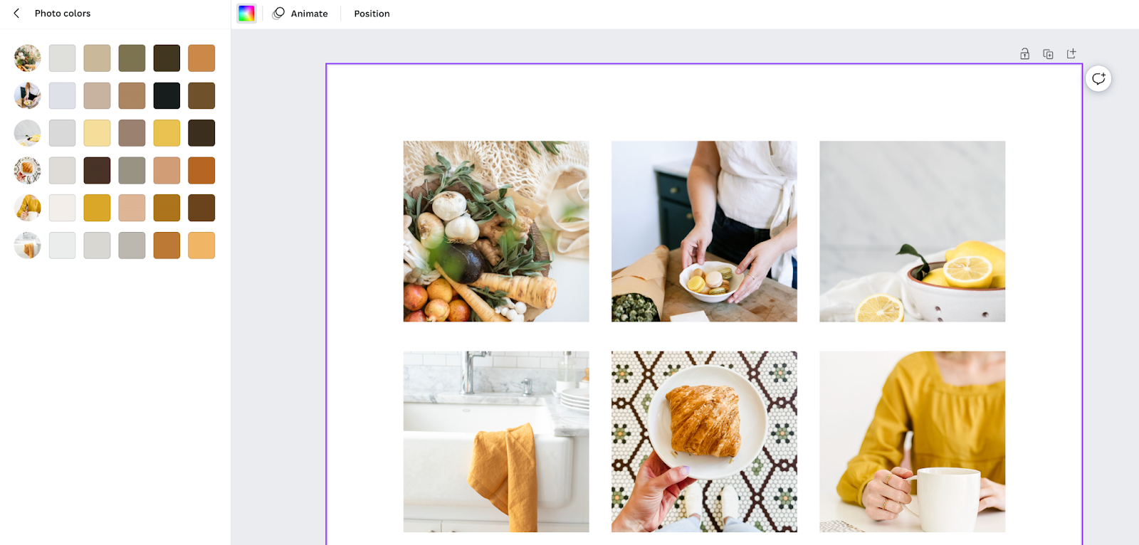
One of the most underrated ways to build a cohesive color scheme is to pull inspiration directly from your own content. Open up your blog or your photo library and take a look at the images you use most often. What colors keep showing up?
Here’s a fun trick inside Canva: create a blank canvas, upload a handful of your recent blog images, and Canva will automatically pull color suggestions based on those images. It’s a great way to build a palette that already feels aligned with your visual content, because it literally is.
Understand Color Psychology
Colors carry meaning, and that meaning shapes how people feel about your brand even if they can’t explain why. Here’s a quick overview of common color associations:
- Red: Passion, excitement, urgency
- Orange: Warmth, enthusiasm, energy
- Yellow: Optimism, creativity, happiness
- Green: Nature, growth, calm
- Blue: Trust, calm, reliability
- Purple: Luxury, creativity, mystery
- Pink: Femininity, romance, warmth
- Black: Sophistication, power, elegance
- White: Clean, minimal, fresh
You don’t need to follow these associations rigidly, but they’re worth keeping in mind as you narrow down your choices. If you want your brand to feel trustworthy and calm, a palette heavy in warm reds might work against you even if you love the color.
Use a Color Wheel to Find Complementary Colors
Once you have a color or two in mind, a color wheel can help you figure out what works alongside it. Complementary colors sit opposite each other on the wheel and create contrast. Analogous colors sit next to each other and feel harmonious and cohesive.
Canva has a built-in color wheel tool that makes this easy. You can plug in a base color and it will generate a palette of complementary options automatically. From there you can adjust brightness, saturation, and hue to dial things in exactly the way you want.
Try the Color Palette Design Studio

If you want a faster, more guided way to land on your perfect color scheme, the Color Palette Design Studio was built specifically for this. It walks you through the process of choosing colors that work together and then shows you how to apply them to your blog for a cohesive, professional look.
Access the Color Palette Design Studio
Completely FREE!
Create a Mood Board
Before you commit to a color scheme, it really helps to see everything together in one place. A mood board lets you combine your color swatches, inspiration images, and design ideas so you can get a feel for how the whole thing works as a unit.
Not sure where to start? Inside the R316 Freebie Library there’s a free mood board template you can grab and use in Canva. It’s laid out with colors in order so you know exactly how to plug them into your Kadence theme once you’re ready. You can access it along with a whole library of other free tutorials and graphics inside the Freebie Library.
How to Set Your Colors in Kadence
Once you have your color scheme ready, it’s time to plug it into your Kadence theme. Head to Appearance > Customize > Colors & Typography to set your colors globally. This is important: always set your colors here rather than changing individual elements on separate pages and posts. If you ever rebrand down the road, you’ll be able to update everything at once from one place instead of hunting down individual edits.
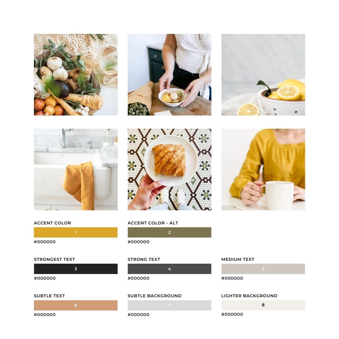
Kadence gives you 15 color slots, and each one has a specific purpose. Here’s how to think about them:
Colors 1 and 2: Accent and Alternative Accent These are your non-neutral brand colors. They’re used for things like link colors and button colors, so think of them as your primary pops of color.
Colors 3, 4, and 5: Strong and Medium Text These should be variations of black, dark brown, or charcoal. Start with your darkest shade in spot 3, then get progressively lighter in spots 4 and 5. Avoid anything bright or light here since these slots are primarily used for text and readability matters most.
Colors 6 and 7: Subtle Text and Subtle Background If you have additional brand colors that aren’t neutral, these are good spots for them. Just keep in mind that spot 7 should be on the lighter side. A hot pink in spot 7, for example, would be overwhelming as a background color.
Color 8: Light Background This should be a light, soft color that works well as a background. Think creamy white, soft blush, pale gray, or a light sage. Make sure your text colors from spots 3, 4, and 5 are easy to read on top of it.
Color 9: White This one stays white.
Colors 10 through 15: Additional Accent Colors These six extra slots are for additional accent colors used sparingly throughout your site. Think of them as supporting players rather than stars. They give you more flexibility to bring in extra brand colors for specific design elements without those colors taking over the whole palette.
Test Before You Commit
Before you make your color scheme official, take it for a test run inside the Kadence customizer. You can preview your colors across different parts of your site without publishing anything, which gives you a chance to catch anything that looks off before your readers see it. Pay attention to how your text reads on different background colors and how your accent colors look on buttons and links.
Frequently Asked Questions
How many colors should my blog have?
A good rule of thumb is to stick to three to five colors total: one or two accent colors, one or two neutral text colors, and one light background color. More than that can start to feel busy and inconsistent. Kadence gives you up to 15 color slots, but that doesn’t mean you need to fill all of them with different colors. Repetition and restraint are what make a palette feel polished.
Can I use my favorite color even if it doesn’t fit my niche?
Yes, with some intention. Color psychology is a guide, not a rulebook. If you love a color, find a way to work it in thoughtfully rather than avoiding it entirely. The key is to make sure your full palette works together and still communicates the right feeling to your audience.
What if I want to change my colors later?
That’s totally fine, and it’s actually easy to do if you set your colors correctly from the start. By setting everything through Appearance > Customize > Colors in Kadence rather than hardcoding colors on individual pages, you can update your whole site at once. Just be aware that any elements where you manually overrode the color will need to be updated separately.
How do I know if my colors have enough contrast?
A good contrast ratio is important for readability and accessibility. Our Color Palette Design Studio will help you make sure that all your colors are accessibility friendly. As a general rule, dark text on a light background or light text on a dark background will almost always give you enough contrast.
Do I need to choose all 15 Kadence color slots?
No. The first nine slots are the core ones that your theme uses most heavily. Colors 10 through 15 are additional accent slots that give you more flexibility for specific design elements. You can use as many or as few of those extra slots as your brand palette calls for.
Ready to turn your ideas into something more?
Our feminine WordPress themes are designed to help you build a beautiful, professional website — whether you’re starting a blog, selling products, or growing a business.

Great article! I’m looking forward to trying this method of choosing theme colors. Thank you!