Mega menus are a fantastic way to enhance the navigation experience on your website, providing visitors with quick access to a wide range of content. With Kadence, creating a mega menu is a breeze. In this tutorial, we’ll walk you through the steps to create an impressive mega menu with Kadence, ensuring your website’s navigation is both functional and visually appealing. In order to follow along, you will need to have Kadence Plus Plan installed and activated on your website.
But first, let’s tackle the most important question…
How Do Mega Menus Impact SEO?
Mega menus, when implemented correctly, can have both positive and negative effects on SEO. Whether or not they are good for SEO depends on how you use them and the specific context of your website. Here are some considerations to keep in mind:
Advantages of Mega Menus for SEO:
- Improved User Experience: Well-designed mega menus can enhance the user experience by making it easier for visitors to navigate your website and find the content they’re looking for. This can lead to longer visit durations and reduced bounce rates, which are positive signals for search engines.
- Internal Linking: Mega menus often contain multiple links to various pages and categories on your site. This can enhance internal linking, which can help search engines understand the structure of your site and the relationships between different pages.
- Keyword Targeting: When you create categories or sections within your mega menu, you have the opportunity to use descriptive keywords as anchor text. This can help search engines better understand the content of the linked pages.
Considerations and Potential Issues:
- Usability: Overly complex or cluttered mega menus can confuse users and have a negative impact on SEO. It’s important to strike a balance between providing a rich navigation experience and ensuring that the menu is user-friendly.
- Mobile Optimization: Some mega menus are not well-suited for mobile devices, and mobile-friendliness is a critical factor in SEO. You should ensure that your mega menu design is responsive and works effectively on all screen sizes. We will talk about this more below.
- Page Load Times: Mega menus can be resource-intensive, especially if they contain images or other media elements. Slow-loading menus can affect user experience and SEO, as page speed is a ranking factor.
In summary, mega menus can be beneficial for SEO when they enhance user experience, provide clear navigation, and are optimized for mobile and speed. However, their impact on SEO depends on how they are designed and implemented. It’s essential to prioritize both user experience and SEO considerations when incorporating mega menus into your website’s design.
Now that we understand how this can impact SEO, let’s get into the steps to build out a Mega Menu with Kadence!
How to Create a Mega Menu with Kadence
Enable Elements & Ultimate Menu in Kadence Settings
Before we dive in, we first need to make sure you have the Elements & Ultimate Menu features enabled. By default these will be turned off until you turn it on for the first time. You’ll navigate to Appearance > Kadence and toggle ON the Elements section and the Ultimate Menu section. Once you turn those on, you can hit Dashboard on the top left and this will reload the page and the new Elements link will become available for you.
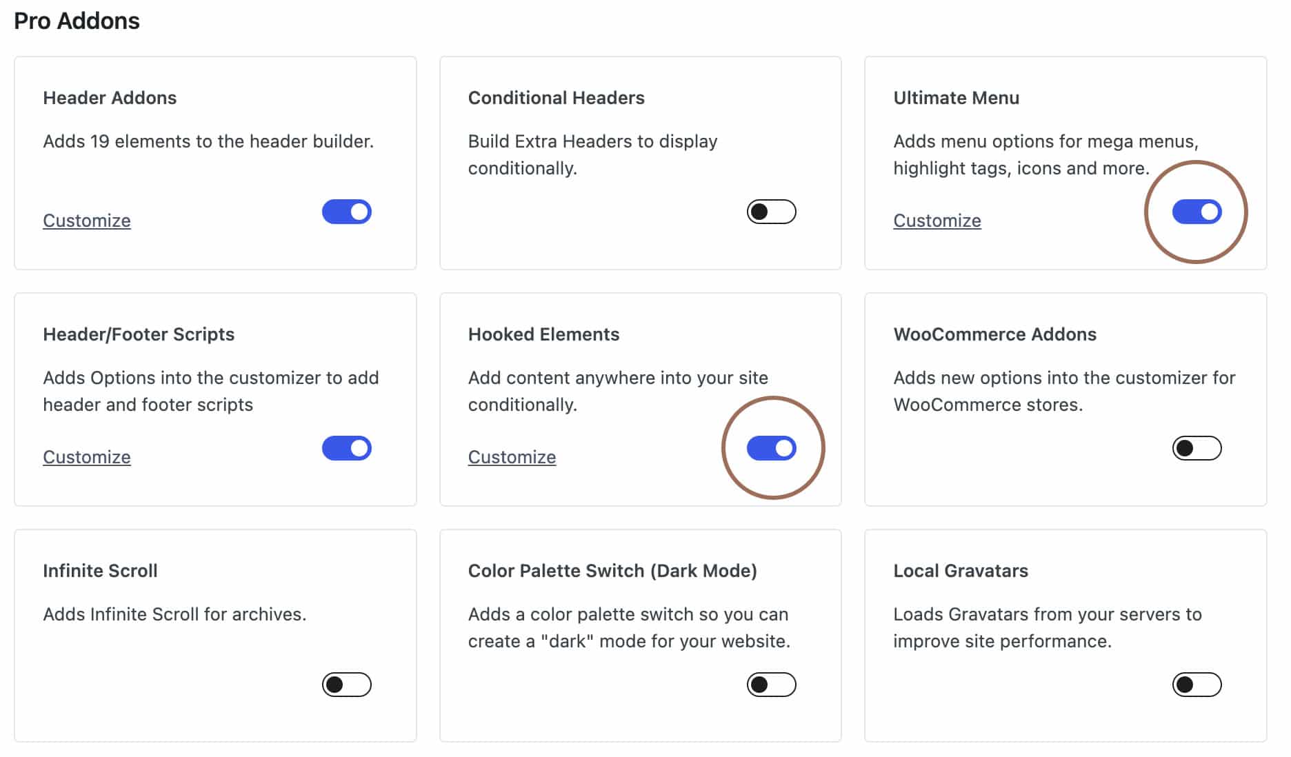
Create your Mega Menu Design Element
To create a mega menu, you’ll first need to design the element itself. This is where you have complete control over the layout, appearance, and content of your mega menu.
You will navigate to Appearance > Elements (under Kadence). Once there you will Add New at the top just like you do when you create a new blog post. You’ll see a little popup, and in that selection you’ll choose “Content Section” and then you’ll see a white page and this is where you’ll start designing your Mega Menu.
Design your Mega Menu
Now we aren’t going to get too much into the design part of this, but you will use one row layout block with however many columns you want and structure your links, posts, images, and anything else you want within these spaces. This entire row from left to right is what your visitor will see when they ultimately hover over a specific link in your navigation menu.
Things to Keep in mind while designing your Mega Menu
- User Experience: Ensure that your mega menu enhances the user experience by making it easy for visitors to find what they’re looking for.
- Content Organization: Keep your mega menu well-organized and avoid overwhelming users with too many options. Use clear labels and logical grouping.
Beautiful Kadence Mega Menu Examples
Here are two beautiful examples of Mega Menus that are great representations of how a Mega Menu can be styled.


Set your Mega Menu Display settings
Once you have designed your new Mega Menu Element, we need to tell this element where we want it to appear in the display settings. This is important, as if this step is skipped, your new Mega Menu won’t appear on your site.
You’ll click the “Element Settings” icon in the top right of the screen.

- Under Placement, you’ll leave this blank so don’t set a specific location. This will come into play in the next step when we Create our Navigation Menu.
- Under Display Settings: You’ll choose “Entire Site” so that this navigation element will work no matter what page your visitor is on.
- Under User Settings, you’ll select All Users.
Publish your Element
Once you’ve set your Display Settings, you’ll want to hit that blue Publish button at the top of the screen and then you’re ready to move to the next step.
Create or Edit your Navigation Menu
Now that you’ve prepared your mega menu design element, it’s time to integrate it into your navigation menu! This is the exciting part!
Should I Create a New Menu or Edit an Existing Menu?
At this point you will either Create or Edit your Navigation Menu. But how do you know which one to do?
If you have a navigation menu now that has a lot of dropdowns, and you’re going to be replacing those dropdown items with a Mega Menu, you can either remove all the dropdown links, or create a new menu.
We will talk more shortly about how these Mega Menus impact your Mobile website design, so if you’d prefer to have the default mobile menu, which I recommend, I would keep this menu so you can assign it to Mobile, and Create a new one that will appear on Desktop.
If you currently don’t have a navigation menu, then you’ll start by Creating a New Menu and only adding your Top Level links to the navigation menu and then move to the next step.
Create a New Navigation Menu
- Navigate to Appearance > Menus
- Click the blue “Create a Menu” link
- Give your New Menu a Name – This is for your reference only
- Using the boxes to the left, begin adding Pages, Categories, Custom Links, etc to the menu.
- Publish your Menu when you’re done.
Edit an existing Navigation Menu
- Navigate to Appearance > Menus
- Choose the Menu you’d like to edit from the drop down menu at the top
- Here you can add/remove links
- Once you’re done making edits, you’ll hit the blue Update button to save your changes.
Add your Mega Menu
Once you have your menu all set, we need to do the extra steps to add our Mega Menu to that menu!
Add your Drop Down Link
Under the Custom Link box on the left, you’ll add a new custom link. In the URL field you will enter a “#” and in the name field enter something like “Mega Menu”.
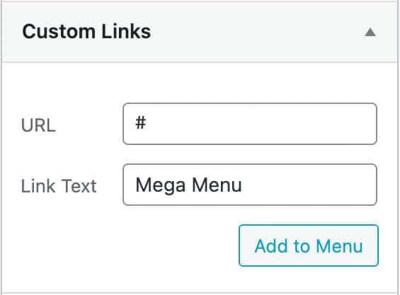
Then you’ll hit “Add to Menu” and it will automatically add it at the bottom of your menu. Then you can put your mouse over it, and pick it up, and move it up and slightly to the right under the link you want it to drop down from. It will look like this when you have it set:

Go ahead and hit the blue update button at the bottom right of the screen and this will save your changes. Updating the menu is important for the next step or you won’t see the correct options.
Update Settings on the Parent Menu Link
Now, you will use the little triangle to the right of the Parent Link to open up the settings of that link. Once open, you’ll see the blue “Menu Item Settings” button and you’ll select that. If you don’t see this button, make sure you have updated your menu.
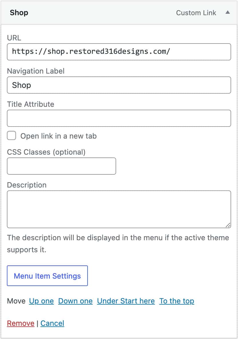
Once the pop up opens, you’ll see two labels at the top. One says “Label Settings” and one says “Mega Settings”.
You don’t really need to do much under the Label Settings tab, but you are welcome to disable this Parent link if it’s not going to go anywhere, or add an icon to this link if you’d like also.
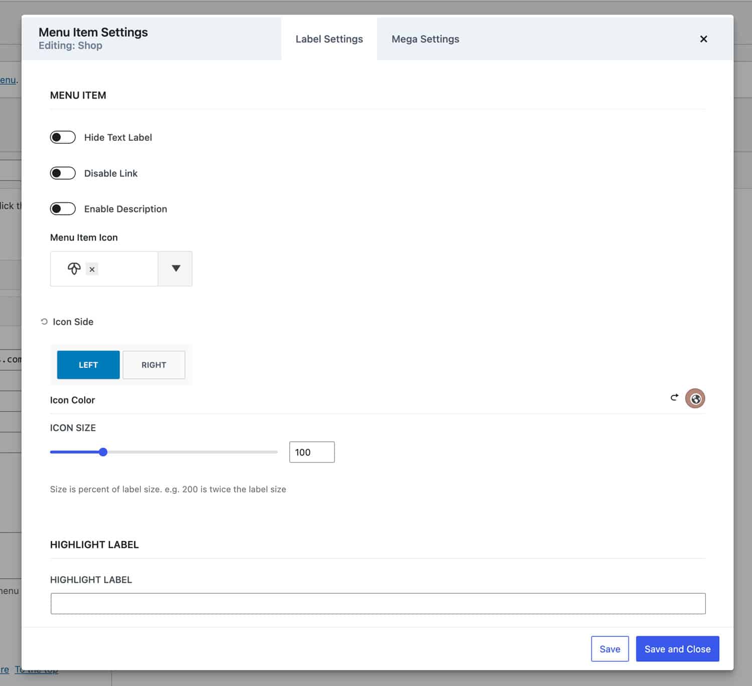
Now flip over to the Mega Settings tab, and here you will turn on the “Enable Mega Menu Dropdown” option. Once that is enabled you’ll see the other options appear. In the available options you’ll choose “Full Width” under Mega Menu Width, 1 column under Mega Menu Columns, and you’ll click the bubble next to Dropdown Background and set this background to white (or any color you’d like if you don’t want white).
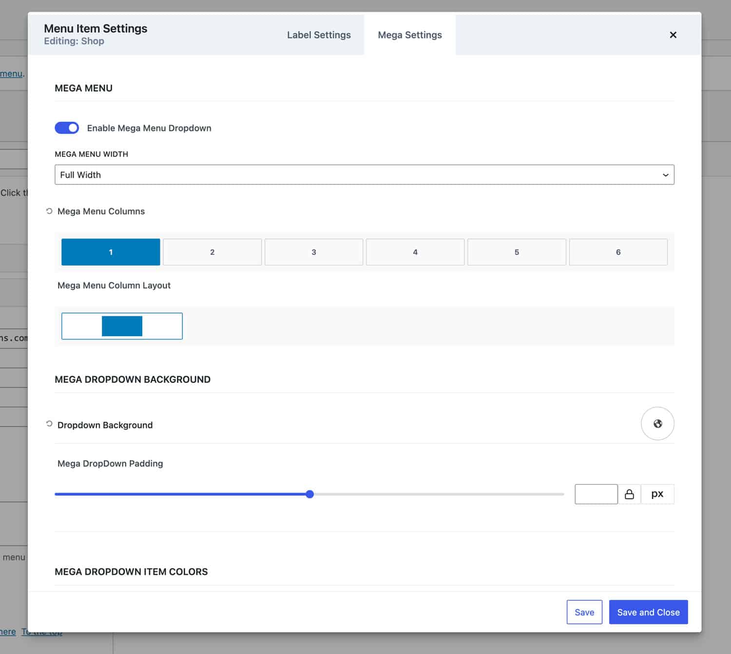
Now, Save and Close in the bottom right, and go ahead and update your menu again with the blue button in the bottom right.
Update Settings on the Child Menu Link
Next, and lastly, we need to assign the Element we created a few steps ago to the drop down menu item.
Go ahead and click the little triangle to the right of the Child Link to open up the settings of that link. Once open, you’ll see the blue “Menu Item Settings” button again and you’ll select that.
Once the pop up opens, again you’ll see two labels at the top. One says “Label Settings” and one says “Mega Settings”.
You won’t need to adjust anything under the Label Settings, so go ahead and flip to the Mega Settings tab.
Once there, you’ll enable the Custom Content toggle. Once that is turned on, you’ll see the option to choose your Custom Element. From the Dropdown, choose the Element you created a few steps back.
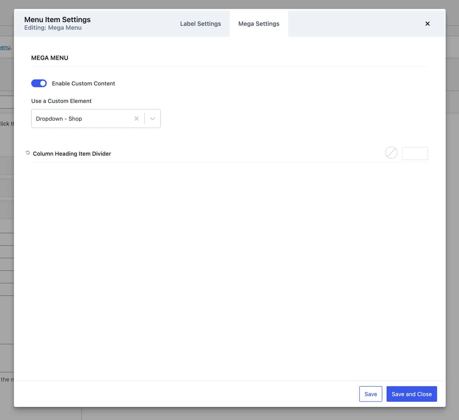
Now, you’ll Save and Close, and then hit the blue Update button in the bottom right! Once you hit that update button, you should see your new Mega Menu in your navigation menu! Wahoo!!
What about a Mega Menu with Kadence on Mobile?
By default, Mega Menus don’t work as great on Mobile as they do on Desktop. I would recommend going to Appearance > Menus > Manage Locations and Assign a different Menu to your Mobile Navigation that has ALL the links you’d like to appear on mobile.
You could modify your Element to be mobile responsive, but this will look different for everyone so this will really depend on your design.
We covered a lot in this post, but hopefully you have a gorgeous Mega Menu on your site now with the help of this tutorial! If you have any questions about anything, feel free to leave a comment and we can get back with you!
Do better following a video tutorial? Watch and subscribe below!
Ready to turn your ideas into something more?
Our feminine WordPress themes are designed to help you build a beautiful, professional website — whether you’re starting a blog, selling products, or growing a business.

