How To Customize The Kadence Theme Header For a Look You’ll Love
Do you want to create a header for your website that will make people stop scrolling and pay attention?
Your website header is a critical digital asset. It’s the first thing people see on your website and its primary purpose is to help guide visitors through your content and offerings. Because it’s “above the fold” on a screen and visible immediately, it’s also a great place for injecting your brand personality and style.
Your brand personality is so important because it’s what makes your brand memorable. You likely remember our brand for our butterfly. I know without even going to her site that Amber Housely has some sort of bloom or flower in her header and her signature pink/blush color. This is Amber all the way and it shines through her brand.
In this post, I’m sharing 5 tips that will help you customize your Kadence Header for a look you’ll love and keep your website memorable.
Kadence Themes From Restored 316
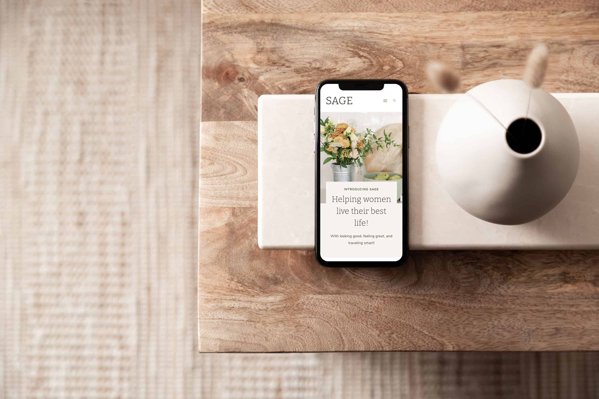
We currently have over 15 Kadence themes that are easy to install, set up, and customize. In most cases, you can take a new theme live in less than 15 minutes! I’m not even kidding!
However, I know that most site owners want to customize the theme to better suit their existing brand. So let’s dive into customizing the header.
Theme Header Goal
First off, “Don’t get stuck in the weeds.” I know it sounds like a cliche, but before you start making changes to your website’s design, make sure that these hurdles won’t hinder your big-picture progress.
It’s so easy to make changes to a website built on Kadence (yippee for no code required!) that you can easily get sidetracked and lose sight of your overall business goals.
Fretting over details and striving for perfection are two of the biggest time-wasters for new online business owners. This is definitely not a good thing if you have limited time to work on your business while also balancing family responsibilities!
So, let’s first identify your #1 goal for your header? Is it to:
- help navigate visitors to your blog content?
- have someone book a discovery call and hire you for the services you provide?
- encourage visitors to sign up for your mailing list?
- direct fans to a course sales page?
Where To Find The Kadence Header Builder
The Kadence Header Builder can be found in the Customizer. To access the customizer, you’ll navigate to Appearance > Customize > Header from your WordPress dashboard. Once in this screen you’ll see many different options for customizing your header, but let’s talk about your options!
How To Customize your Kadence Header
You know that feeling when you’re about to start a new project? That tingly excitement. Well, I hope you feel it right about now. Here are 5 tips on how to customize your header:
Kadence Transparent Header
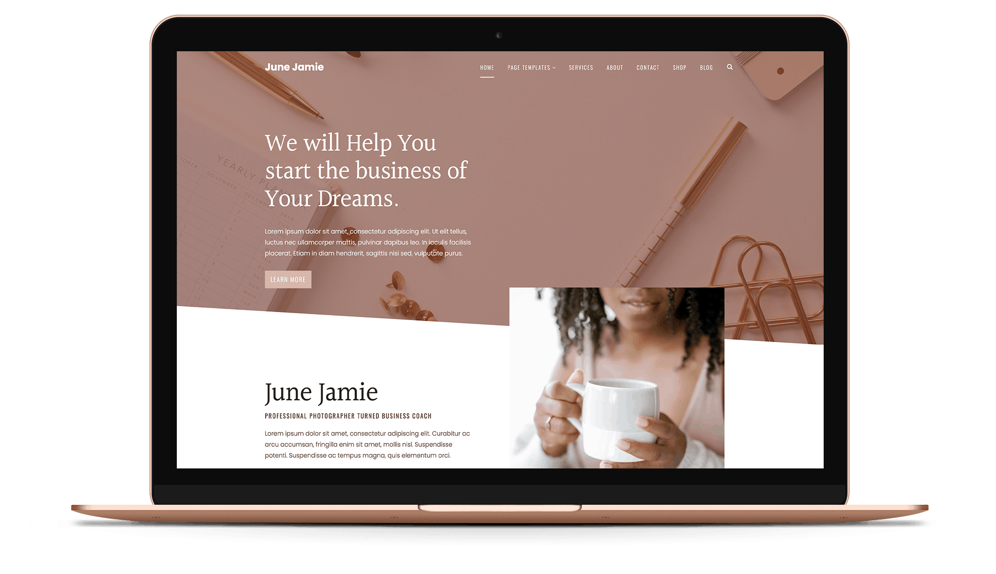
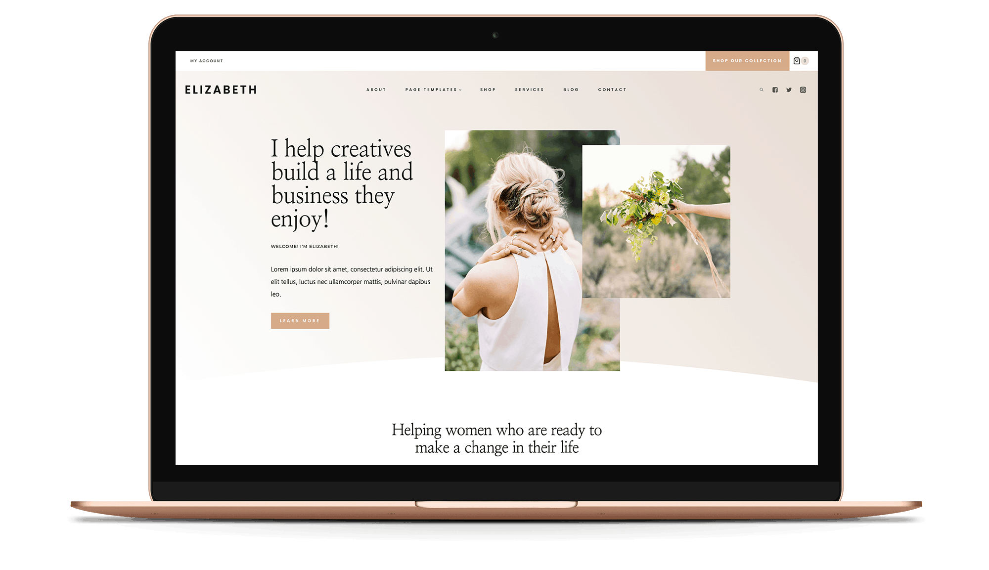
Have you seen the header of our best-selling Elizabeth and June WordPress themes? They both have a beautiful transparent header that allows your page content to shine through. But it can be tricky to set up correctly – especially for mobile users.
If you are looking for help with tweaking this unique feature, then I have good news.
I created a click-by-click 20-minute video tutorial that you can access for free! You will learn:
- the difference between a sticky header and a transparent header
- how to adjust the transparent header on a page-by-page basis
- how to adjust the fonts and text size, so it is legible even when viewed on mobile devices
Watch the “Customize Your Header With Kadence” video here.
Kadence Sticky Header
The Kadence Sticky Header is the perfect feature to display a call-to-action at all times!
By setting a header row to “sticky”, your website will have a persistent header row that will scroll with your visitor. You have the option to set any of the three header rows to the sticky header setting. And the video I mentioned above will show you how to use this feature.
Here are two of our theme examples you can check out for inspiration:
- The Elizabeth theme demo displays a sticky header to draw attention to the “Shop Our Collection” button.
- The Sage theme demo is an example of how the sticky header is used in row 2 for the site title and navigation menu.
Some popular ways to use your sticky header bar are:
- Announce A Sale Or Discount
- Share A Lead Magnet
- Link To A Sales Page or Shop
- Book a Consult/Discovery Call
Add A Background Image or Pattern
Using a seamless pattern or texture in your website header is a great way to add some character to your header. It’s also so easy to update, so if you try a pattern and you don’t love it, you can easily swap it out! Patterns are great because they can be used across the board… on your website, facebook header, instagram posts, pins for Pinterest, and so much more! Patterns help to create a cohesive look for your brand which helps with that memorable brand we talked about earlier.
If you are interested in purchasing affordable patterns or design elements to create a header design, Creative Market is a great resource for finding these!!
Here are two of our theme examples you can check out for inspiration:
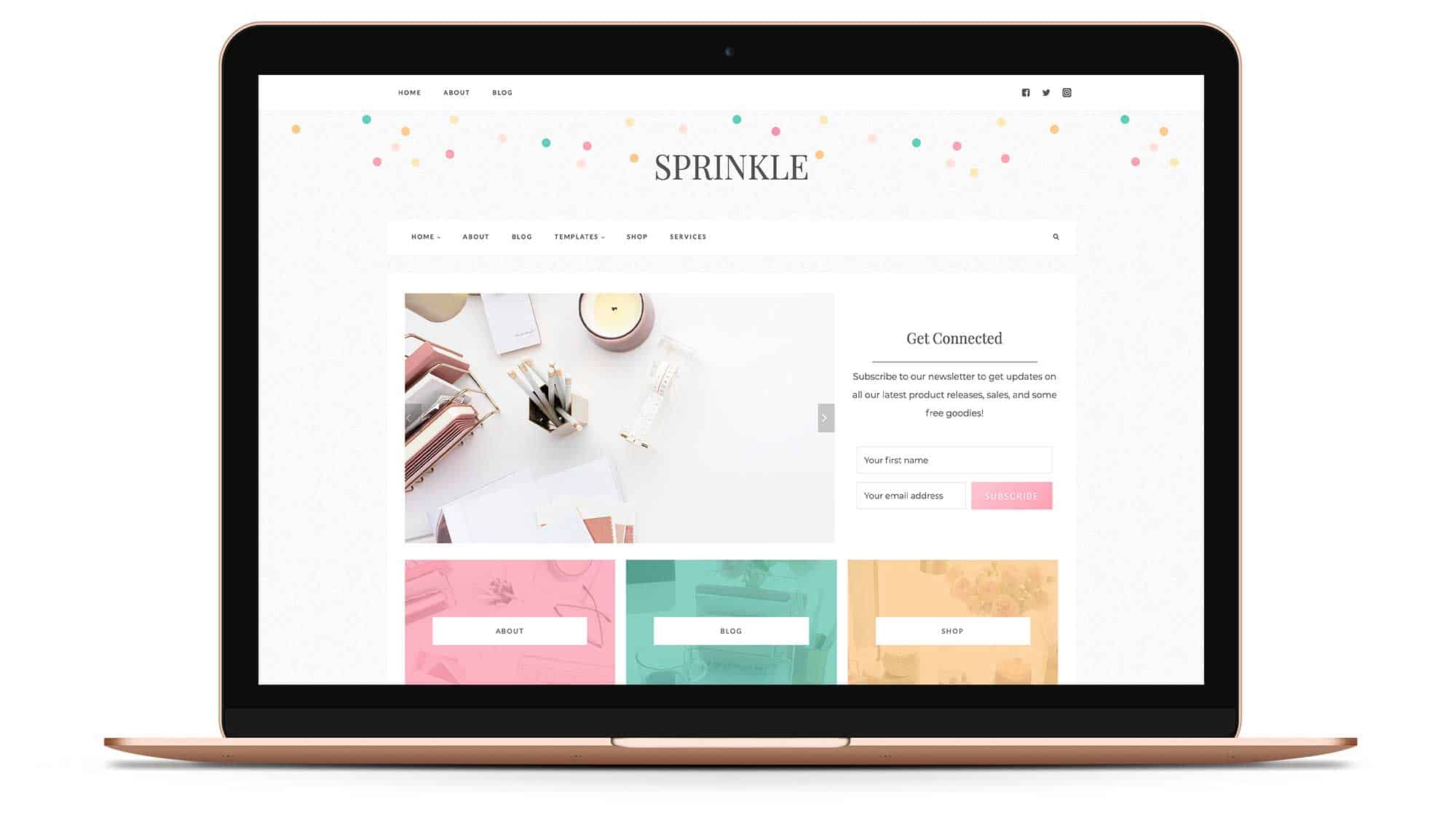
- The Sprinkle theme demo displays a colorful, cheerful polka dot pattern.
- The Market theme demo displays a subtle texture in the background.
Brand Logo
Our Kadence themes include several formats for displaying your logo and/or site title:
- Logo only
- Logo and Site Title
- Logo, Site Title and Tagline
There are also several options for the layout when using either the Logo and Site Title, or the Logo, Site Title and Tagline:
This is helpful if you have an element that you want to go alongside just the text of your website name, similar to how we have our Market theme. This is using the Logo and Site Title option. However, if you have your logo all designed together, which is the case more often than not, you’ll just select the Logo only option!
Having your own custom logo is really helpful in keeping your brand professional and memorable. You don’t have to spend a fortune on creating a logo, but I do highly recommend either hiring a professional or purchasing a premade template. If you’re not a designer by nature, logos can tend to look very cookie cutter and amateur and you want your customers to know you’re professional immediately when they land on your site. This investment, aside from your actual website theme, is one of the top investments for any new entrepreneur.
Pop Of Color
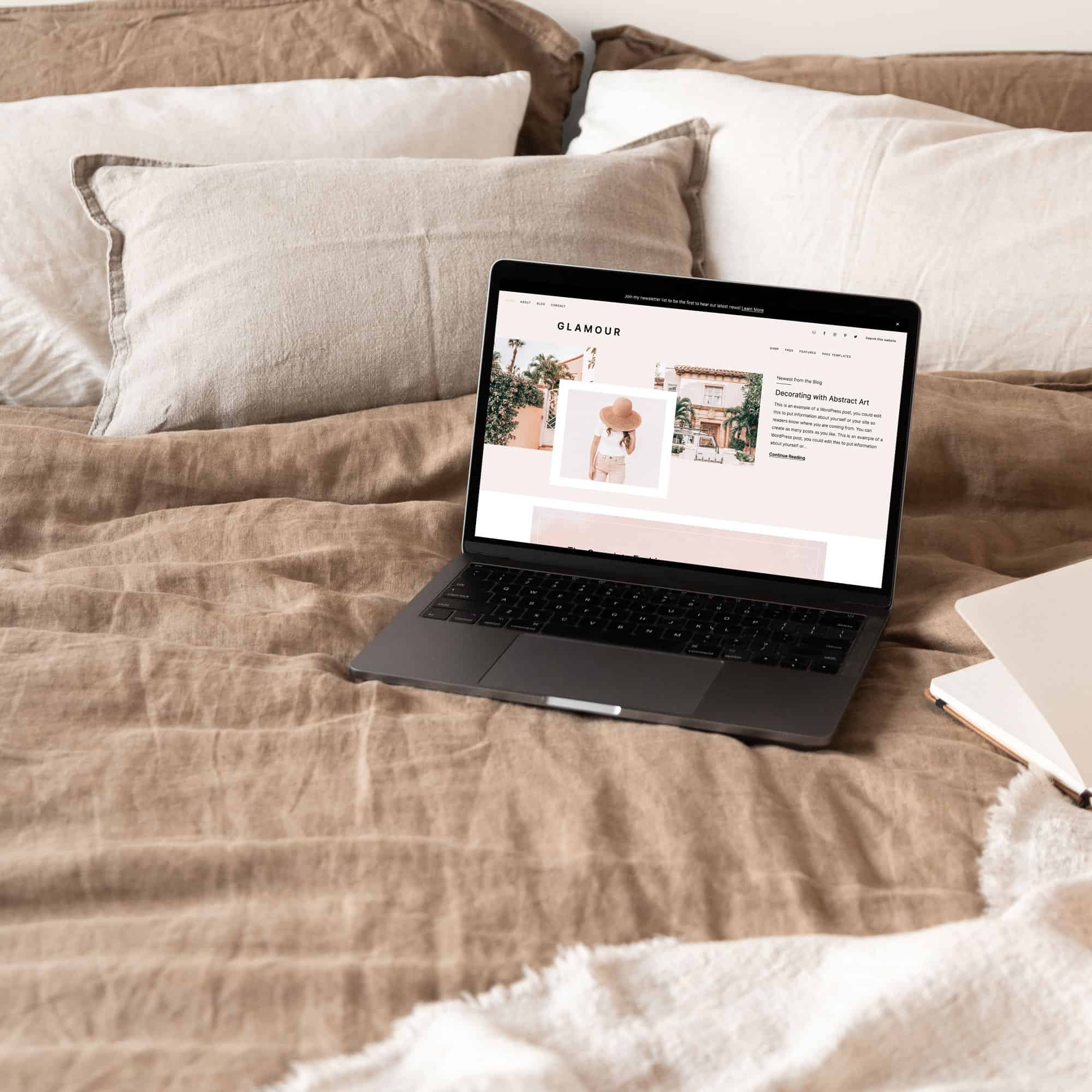
If you check out the demo for our popular Glamour Theme, you’ll see that I’ve got the light pink color in the top header. This just helps to give some personality to the header and separates the content a little bit. You can easily change the colors of any row in the header. For more information about using the Kadence Global Palette you can see this tutorial which is super helpful.
I hope this article helps you feel confident in customizing your own header. But, if you want to delegate your theme customization, then that’s ok too! We are here to help you and are available for hire for customizations like this!
To request more information about our theme customization service, please submit a ticket so we can give you a proper quote for your specific needs.
Join The Restored 316 Community
And don’t forget to join the Restored 316 Community. In our private Facebook group, you’ll have a safe place to:
- Share your questions and get feedback from others in the group
- Save time on trying to find the right answers
- Connect and make friends with other women who share your blogging/online business interests




I agree that the header is a major piece of a website, it gives visitors a feel, a first good or bad impression.
I quite like the option of a background image and preferably above the menu, being new to Kadence I haven\’t cracked that yet. Any tip you may have would be greatly appreciated!
Sure! If you click the little settings tool at the very left of the row you want the background image in, you can add a background image in the settings there!
I’m trying to find where and how to add the Pinterest code in the head section. How do I do that in Kadence?
Thanks!
Darlene
You’ll want to install the Code Snippets plugin and once you have that installed and activated, you’ll have a new option in your dashboard under Code Snippets > Header & Footer and you’ll place your code there.