A “Brand” New Journey
Back in March of this year, I began feeling on my heart that it was time for a re-brand. A very intentional and diving deep into the heart of this brand type of re-brand. We’ve spent the last couple of years working IN this business by producing Premium WordPress Themes and all the behind the scenes things that go along with that, and we simply hadn’t stopped long enough to work ON this business and visit the items that weren’t quite working well or to step back and see what our brand was portraying.
After spending some time over several months really digging deeper into what the heart of this company is, getting super clear on where we were headed, and charting a course for the future, we decided it was time to refresh and the hunt for a branding designer began.
Why hire another designer?
When I presented all this to my team, their first question to me was “Why don’t you do the brand?”. A very legitimate question considering I do branding for clients, and I’m sure you’re asking the same thing. First, let me say that designing for yourself is one of the hardest jobs EVER! I’m my own worst designer and while I’ll design something I love today, a month from now I’ll be sick of it.
Over the last 3 years I’ve hired hand letterers/calligraphers to hand draw a custom logo for us, but this time I not only wanted a custom hand lettered design, I wanted artistic elements (icons and patterns) that were unique to our brand, and something that didn’t fit on the trendy scale. With all that in mind, I wanted to hire a designer that was not only artistic in creating icons and patterns, but also an expert at brand cohesiveness to take the ideas I had in my head and make them become a reality.
After searching for a designer that really connected with my design style and personality I finally found a designer I fell in love with after some random searching on Pinterest for something completely unrelated to design. I immediately emailed Melissa Yeager and shortly after we set up a Skype call and talked about the heart of our brand, the direction we were headed, and what we really wanted to portray… and I was absolutely sure she was the one for us! It took me a little more time to pray over the direction we were about to take and make sure we were making the right move as a company. We took a family trip to the beach and during the break it became so clear to me that we had to make this move and the moment we returned I emailed and told Melissa we were ready! Sometimes it takes just getting away into the quiet for things to become clear to us, and it’s something I have hopes of having more often.
All this said, I’m so excited to finally unveil our new brand, new website, new support, and new products to you today! It’s been a huge labor of love and there are so many people who have played a huge part in this. Every single decision about this new brand has been thought through and has an intentional purpose. From the colors to the icons… they have a purpose… and I want to share some of the behind the scenes with you today!
Making intentional decisions about the brand
What did we want to communicate with our customers?
First and foremost, we wanted to communicate that we are in this together. We are about building a community, not about gaining followers. My hearts desire is that one day we can all gather around coffee and learn this whole website thing together, but in the meantime our brand and website can communicate that we care about you. Not just in the theme purchase… that is just the vehicle to start your adventure… but beyond the theme purchase. We want to build a community around you, help you grow, and give you a helping hand along the way.
Choosing to keep the butterfly, refine it, and add other icons
We, of course, wanted to keep the butterfly in our brand. It’s been a part of our brand since the beginning and it’s never going to leave this brand. It’s significance is so important to the mission of our hearts and why we wake up every day to continue doing what we love and serving others. It’s meaning is two-fold – to symbolize the transformation of your business when you work with us – and the life of a butterfly is the perfect picture of the word restored. A caterpillar can be viewed as something ugly, but when it transforms into a butterfly it becomes beautiful and it’s life is in fact Restored.
We also wanted to add some graphic icon elements that were a juxtaposition of literal elements that describe what we do, but also add bits of nature to them to signify the growth process of the entrepreneurial journey. In one of the calls with Melissa, I mentioned a computer with leaves coming out the back, and Melissa said “How about we put a butterfly on it?!” and I was like… SOLD! Melissa beyond blew my expectations with the icons she developed for our new brand.

Being intentional about our colors
When choosing our color scheme, there were several things that were considered. Choosing a color scheme is by far one of the hardest aspects of brand development in my opinion. Perhaps this is because I love every color under the sun, so choosing a scheme that really communicated the message we wanted, while also fitting our target market, and looking nice next to our products was at the forefront of this decision. I knew we were keeping a scheme very similar to what we had as well as the pink… we create Feminine WordPress themes, so pink is a must. When our family was in Florida, it hit me that our business name is Restored 316 which very clearly says that we are a faith based company, so what better way to represent God’s creation than the colors in the sky at sunset on the beach.
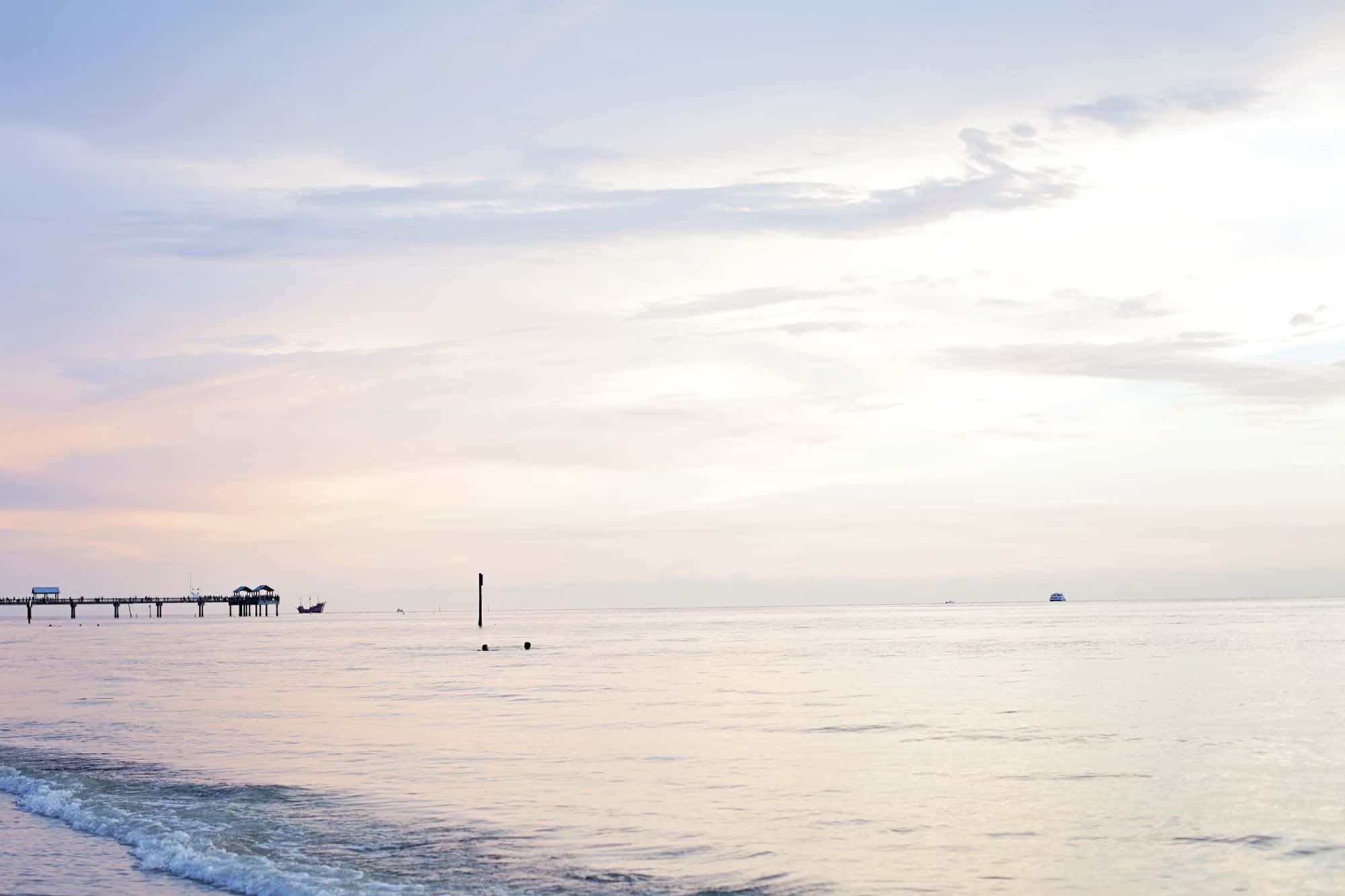
The pink that appears in the sky at these sunsets is the perfect blended shade of pink painted in the sky and everything else that surrounds it is the perfect match for it. Never mind that seaside is my absolute favorite place to be, but I knew that the color scheme for our brand would represent my favorite piece of God’s creation!

Deciding on our website design
Once we started seeing the branding pieces come together, we began brainstorming our new website design. We knew there were many behind the scenes issues we were experiencing so we had many many team calls discussing all the items that we felt needed work. We also sent out a survey to get some feedback from all of you about what we could do to improve the experience on the site as well as the material we provided. The survey results completely blew my mind to be honest. What I thought was working well actually wasn’t working the way I had hoped. We also realized that a lot of people were missing some of the services we offer and had absolutely no idea we offered them. We knew all these things needed to be addressed!
I got to work on the site design and we’ve all gone back and forth quite a bit to make sure we all feel like we are covering everything that needs to be addressed. This new site design that you see has gone through quite a lot of tweaking over the last 3 months to make sure absolutely everything is perfect!
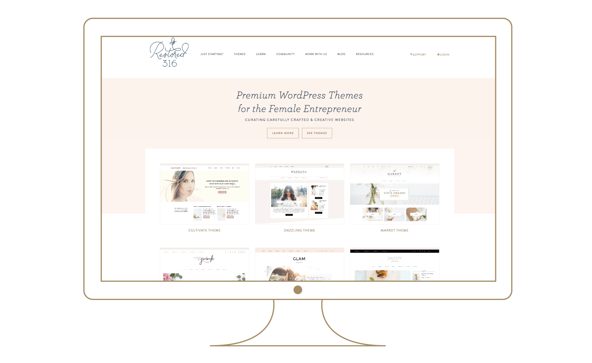
What’s new
New support area
The one thing we took away from our survey results was that we absolutely needed to revisit our support site. This was the thing I thought was working well, but overwhelmingly in our results we realized the setup of our support wasn’t working for the beginner. So we literally just went back to the drawing board to come up with a solution that would be easy for the beginner, easy to navigate, and would have great searching capabilities to be able to find what you’re looking for in the midst of all the content we provide. After many discussions we agreed to move all our support over to a HelpScout Doc site so the search capability was front and center, and then we could easily organize more than just our theme tutorials and help answer all those common questions we get since they tend to get lost in our blog post section.
Our new support site is a huge huge labor of love as Lani and I have both painstakingly gone through every single tutorial for every single one of our themes and moved them over to the new platform as well as updated every one to make it as easy as possible with new screenshots and more! There are over 350 helpful articles in our support area to help get you going, get you setup, troubleshoot, and everything else in between. We’d love for you to take a peek at the new support site and we welcome any feedback on this.
New Downloadable Resources
Another area that we felt needed improvements was the tools we provide for those of you just getting started. There are so many questions when you’re starting this whole journey online and I really wanted to help with that process. After all, that’s what we do! Our How to Start a Website page has been completely redone and is also available as a PDF download so you can easily print it off and follow the steps as you’re getting started.
We’ve added a new Learn tab at the top that currently has 3 free downloadable PDF documents with really helpful information. Our Resources page has also been completely redone as I compiled a list of over 100 resources that are incredibly helpful and that I’ve learned along the way.
We, as a company, are beginning to shift gears a little bit and really want to teach you how to do all these things along with providing beautiful WordPress Themes. This launch is just getting us ready for all we are going to have to offer in 2017!
Many many other changes in our “Brand” new Journey
Nearly every single page of the site have been redone and refreshed including our new about page. There are so many changes that I can’t name them all, but I’d love for you to have a peek around.
My prayer is that you see our passion and heart for you through this new brand and know that we care for you. Truly, madly, deeply… care for you! This company isn’t about me (Lauren) or even the team that runs it.. it’s about you and the brave adventure you’re on and we just want to be that helping hand to see you through to success and encourage you along the way!
If you see absolutely anything that seems like a bug, typo, broken link, or something that we missed that you need some help with, we would love your feedback so feel free to leave a comment below!
If you’d like to read further into our rebrand from Melissa’s perspective, you can see her blog post here.

Oh…my…word….those icons/logo are amazing and the new site and colors are on point! Love it all. So delicate and feminine, yet amazingly simple and says so much. Kudos to Melissa. She knocked your brand out of the park. Lauren and gang, keep up the great work. Know that it is appreciated by all of us Restored316 users. 🙂
Thanks so much for the kind words, Becki! Restored 316 was such an amazing brand to work with 🙂
Thank you so much Becki! I so appreciate your sweet words and I’m grateful this redesign has been so appreciated! Melissa was beyond amazing and I’m so grateful for her skills!
As someone who has followed your work over the years, I’m so pleased (and proud) to see you evolve the way you have. The new design is beautiful, and I think the entire team did a wonderful job. Keep up the great work, and I look forward to seeing what the future holds for you!
Thank you so very much Brian!
The amount of time you all must have spent on this project and rebranding is amazing. The resources page alone is extremely helpful. This deserves both a thank you and a congratulations! I currently use the Darling theme and plan on building another website with the Market theme and I can’t wait. Much more success to you and your team! -Kathy
Kathy, Thank you so much for this! Obviously this redesign and everything that went into it took an incredible amount of time, but it’s been so worth it to add value to our customers!
I can’t wait to see your site with the Market theme so please be sure to submit that to the showcase so I don’t miss it!
Congratulations. Your hard work and attention are obvious and the site looks and feels great. Your bravery and intention have paid off. I pray success and favor follow.
Thank you so very much Resa!
Love everything about this Lauren, especially your desire to stay true to your original intentions. The logo, the colors, the icons, oh my, all so lovely and reflective of your brand. Congratulations for new adventures ahead!
Thank you so very much Pam! I so appreciate your comment!
The new site is really quite breathtaking! Thank you for continuing to be a positive role model in the industry, Lauren. Your work, and the intention, thoughtfulness and heart you put into it, is inspiring!
Thank you so much Tracey! Your comment means the world.. thank you for your sweet words!
Congratulations on the redesign and launch! It’s absolutely stunning, and I would expect nothing less. Lots of love to you and the whole team!
Thank you so much Katie! You’re the best! <3
It looks beautiful! I found you because I’m looking to redesign myself and a friend recommended your themes. Excited for you and the final results look fantastic!
Cajun (love your name!), thank you so very much! I’m so happy your friend told you about us and I can’t wait to see your new site!
Hooray!! I’m so thrilled to see your new identity go live and proud to have had such an integral part in your transformation. Working with you was SUCH a pleasure, and I’m sending you all my best vibes for the exciting days ahead!
Oh Melissa there aren’t words big enough in the English language to adequately describe my gratefulness to you! I’m so thankful for you, your professionalism, and your skill to help make this all happen! Working with you was incredible and I’m so excited to see what the future holds for the both of us! You’re a crazy talented lady!
That makes so so happy to hear, and thank you so much for the kind words! I absolutely agree! Can’t wait to see what’s in store for both of us!!
I love it! Your colors and branding are great! I have personally enjoyed using a couple of your themes for my blog and I will have to say your support team is awesome. Thank you!
Thank you so very much Kendra!
Congrats on the re-brand! Everything looks beautiful (and inspirational), as always!
Thank you so much Lori!
This is so beautiful, and I love that you’ve shared your rebrand story; it’s always interesting to see someone pull the curtain back on their business!
Wishing you and your team much continued success!
Hi Sandee!!!!
Thank you so much Sandee!
I love everything about this new website so much. I’ve been clicking around to see everything that’s new and all feels so warm and welcoming and I love your colour inspiration – I love the beach sunsets too.
Congratulations to you Lauren and Melissa and all your team – you’ve set the bench mark high for all of us to aspire to 🙂
Thank you so much Helena! I’m so happy it feels warm and welcoming… exactly what we wanted!
Lauren! Everything about this is beautiful! I’ve always been drawn to your brand and I love the honesty and transparency behind everything. Thank you for sharing your brand story with us – that was pretty cool! I agree with a lot of what you said – especially the support area. For us advanced designers it wasn’t too bad but the beginners definitely had some issues. I remember when I first found you through StudioPress, you were still “hiding” behind the camera – that used to be your profile picture for your themes. I absolutely love how much you’ve blossomed and come out of your shell to own your brand. Congratulations again on this new journey. Totally stalking Melissa now LOL!
Thank you so much Chrissy! SO crazy to think I used to hide behind a camera.. most people don’t know that I never once shared my face online for the first 7 years of this business. I’m grateful for how far this business has come and also how far I’ve come in my personal life to not fear the vulnerability.
Definitely go stalk Melissa… she’s amazing!
The new site looks beautiful, ladies! Melissa did a great job and I’m so glad you kept the butterfly. I adore the new icons! I can’t imagine the amount of time you spent behind-the-scenes to get everything done, but thank you so much for your hard work to make the site an even better resource for those of us using your themes. Off to browse it now!
xoxo, erin | sandsunandmessybuns.com
Erin, thank you so very much for your comment! We adore those icons too! This process certainly took a lot of time and effort for many many people involved, but it’s all worth it to make things as easy as possible and add value for our customers!
This redesign is really lovely, clean, and easier to navigate. Love it!
Thank you so much Krystal!
Oh wow! What a pleasant surprised when I hopped over to see your redesign! Absolutely gorgeous! Congratulations!
B
Hooray! Thank you so much Bren!
I’m in the process of rebranding and I’ve been drawn to you because of your beautiful themes but also because of your faith. What an amazing post and drop dead gorgeous new site! It’s everything I would want my own readers to feel about my own site, uplifted, encouraged and renewed. Great job and may God continue to bless the work of your hands!
Marty, thank you so much for your sweet comment! All those things you mentioned where exactly how we want people to feel so I’m so grateful that resonated with you!
The site, and logo elements are beautiful Lauren. I also love the pictures of you and your office. Great job, everyone!
Thank you so very much Kristie!
Love this Lauren! Congrats on the beautiful rebrand and thanks for sharing your story! I love when Melissa shared the sneak peek to the pattern for your brand, and when I saw the new logo it clicked, this was the secret project haha! Praying for your continued growth and success!
Thank you so very much Sasha-Shae!
Everything is sooo beautiful! <3 I love your work Lauren and have followed you since you were making Shoppe Pro themes! I've always admired you and your work and you have always been someone I've looked up to as a designer! Love your new brand!
Thank you so much Krista!